Friday 2 December 2011

Other previous ideas for the Digi pack

All final products are derived from previous ones and lots of different ideas. Here are some of my other ideas that were experimented with for the digi pack. Eg. Foals written in 6 foot letters with acorns, skylines with surreal clouds and a view of the sky through woods.


Magazine cover

When creating the magazine cover i wanted to create an entirely new image that kept the ideals that the Album Digi pack had created, for this i kept the theme of the bright blue sky edited for a surrealistic feel, I started with this plain but aesthetically pleasing image of the sky which was perfectly blue and then to break up this consistent image a trail of a plain running through and stopping half way through the image.


At the end of this plane trail to keep a surrealistic view i took the original image of Alex Atkinson that i used in the three images in the Digi pack. I then made this photo very small and put it at the end of the plane trail as if the Character was creating the trail instead and looked at though he was falling from the sky to the Earth.

I then put the font from the Digi Pack and put it at the bottom of the image then used a clear white text to give information on the release date, then at the very bottom gave a 5 star review keeping a clear and precise text at the bottom of the clear and surrealistic image.

Back of Digi Pack

The back of the digi pack is somewhere where the songs are shown and the order in which they play in. The image has to support the songs being shown in a clear and distinct manor. I wanted the sort of retro 70's feel to continue to the back of the Digi pack but at the same time did not want another image to be on the back as generally it ruins the images look and also does not support the song title list in a clear enough manor, even the band Foals in their Total Life Forever album do not use a visual image.


For mine i started with the retro image pattern:


With this repeating pattern i used as a background image which gave the retro feel, i then added the text i had originally used on the front cover as this kept the consistency running through the Digi pack:


Then by adding the solid black retro surf like electro font for the band name 'Foals' kept the consistency then by adding the Transgressive record label and barcode which is consistent of most professionally produced Album's.

Inside and Back of Digi pack

When studying other Digi packs i realised that the inside pages were three 12 cm squares in a row, with this in mind i decided i wanted to create three images that somehow linked together. Starting with an image i took of home park which i'd spent time editing to a surreal point much like the front cover i decided to duplicate the photo and have it as the background in each square with something different happening in each square on the same background.


I decided the variant to be changing in each photo would be fittingly the character (Alex Atkinson) who plays the dead body in the video and as there is a theme of resurrection in the video i thought it would again be fitting to have a theme of resurrection in the three images, for this i decided to have the character appearing out of the water, further and further in each shot. To keep the surreal feeling continuing i decided to not just have one person resurrecting but to have the same person duplicated 12 times at different points in the water. I cut out the image on photoshop of the character and then layered it on top of the original image with in the first image just his head visible, then the second his head and chest visible then finally in the third image his whole body above the water and a couple of people appearing to fly towards the sky.


Digi Pack Planning


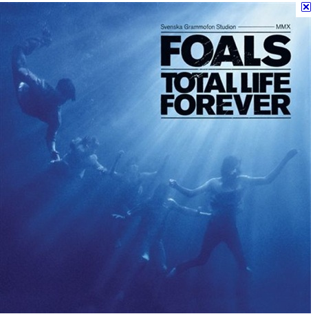
Foals generally go for a surreal tint to their art work using water clearly in their album cover, when doing my album cover I wanted to continue along a similar vein to foals, but take things further than foals generally do. With the thought of surrealism in my mind I went about creating what was to be my front cover of the album i wanted to produce something very eye catching to the viewer that was both real and imaginary at the same time. I started with the image of looking up through a canopy of leaves at a bright blue sky. I then edited it to have a tint of surrealism about it as all the colours I have enhanced to a non realistic state to give an almost retro 1970's look about it, I edited the photo using iphoto and played about with the editing software it provides until I found the right levels to make the photo achieve what i wanted.


I then on photoshop took a font i liked and put that on top of the edited photo with the words, 'Foals' and 'Total Life Forever' over the top showing the band and album name.


I then ended up with with my album cover in completion with a surreal feeling to a natural image.


The themes i presented in my album was important in connecting with my original film treatment as in the treatment as there is a question raised in what is reality, there are dreamlike qualities and the viewer is left with a question of was the dead friend character resurrected to spend one last day with his friends before returning to the grave or was the love so strong and the need to see the dead friend so strong that it was just a dream desperately held onto? so was important to create an image to the viewer that is real but with an unreal quality, a beauty to it but a sense of unreal to the image at the same time.